What is the overall sentiment of the bay area? What is the distribution of this sentiment? What are people happy or sad about in a given area?
Introduction
The San Francisco Bay Area is home to a very diverse population. There are many different people from different racial profiles.
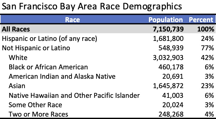
What's more interesting is that individuals of the same race tend to live around each other. The reasons behind this could be due to a multitude of reasons. One may want to be near social connections. Some others factors may be housing, employment, and police discrimination that separates races.
Race and Ethnicity 2010 - San Francisco Bay Area
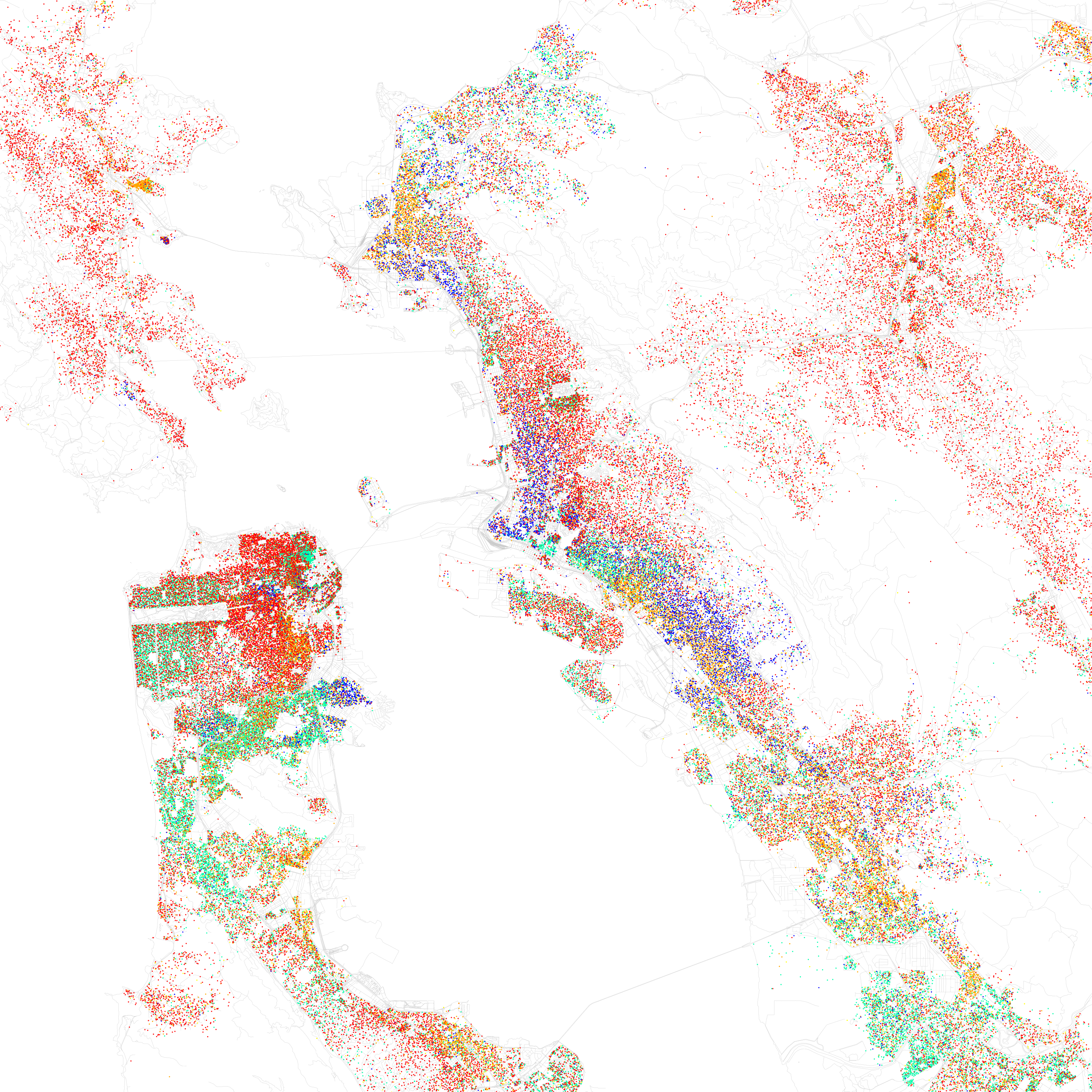
Furthermore, these racial clusters tend to define the cities they are in. Despite being in close proximity within each other, each city has its own distinct culture. This is what provoked the question in the beginning of this post. What if we figure out which cities are happier than others at certain points in time? With this classification, we can possibly find out what people are happy or concerned about, something we can't do without surveys and directly interacting with people.
Even more interesting is that during the time of this analysis, COVID-19 has taken effect and the data gathered is during the time when the waves of extended shelter in place were announced. Therefore, models should have an easier time isolating COVID-19 responses. However, if replicated, it may not lead to as interpretable results and may need further analysis.
See my github repository to repeat these results or conduct a similar analysis.
Data Gathering
Training Dataset
I used the Sentiment140 dataset. It has a large dataset of tweets which uses distant supervision. They used emoticons to help label their tweets (labels were not created manually), read more from their paper. This was the only dataset I found that was large enough to train a neural network and had justification in building the dataset. There were some kaggle datasets, but they didn't give any background on how labels were created, so I was concerned with the validity. One great thing about the Sentiment140 dataset is they impose some assumptions, but then each classified tweet is consistent and uses the same rules. That means human bias isn't imposed differently on every tweet, only imposed before classification.
Test Dataset
I combined two test datasets. The first one is provided by Sentiment140, the second is created by Sanders Analytics. It's important to note that I didn't use Sentiment140's neutral tweets, and instead relied on Sanders Analytics neutral tweets. Since I trained the model on only positive and negative tweets, having a large number of neutral tweets to adjust thresholds to classify neutrality showed to be innacurrate. The thresholds would overlap (i.e. bigger than 0.4 should be positive and lower than 0.5 would be negative), but eliminating a large number of negative tweets resolved this issue. I looked over both datasets and I chose Sanders Analytics' neutral because the tweets were more diverse.
Application Dataset
The data gathered for this dataset uses Twitter's Standard Search API. It allows developers to access tweets within the past week along with user information. It's worthwhile to note that the API I was using (standard) has incomplete data fidelity.
I had access to a large corpus of geotagged tweets, however, they didn't have the tweet's texts. Twitter's API couldn't find the tweets because it was so long ago. So, I decided to create my own dataset.
I gathered all data within 40 miles of the center of the San Francisco Bay from Twitter's API. Twitter has a way of reverse geocoding tweets even if the user doesn't share their location. I gathered 700,000 tweets from this area that were tweeted between April 25th and May 2nd of 2020.
Twitter allows users to set their location. They can set it to anything, it doesn't have to be their location at all. You could live in San Francisco but set your location to Kuala Lumpur. So I only took the tweets that had users whose location was a bay area city. The thought is that if they tweeted from within the bay area and their location is set to a bay area city, then there's a high likelihood that they live in that city. I ended up having about a quarter million tweets in my constructed dataset.
Models
The goal is to build a classifier that takes in a tweet and outputs its sentiment, -1 for negative, 0 for neutral, and +1 for positive.
I started with a baseline model of Naive Bayes, however that showed that it was slightly better than guessing. Logistic regression didn't converge. I didn't try an SVM because the training set had only positive and negative values, yet we also needed to compute the neutral tweets which would use thresholds on probabilities predicted by the classifier, which SVM's aren't necessarily great at. Then, I turned my attention toward neural networks, specifically LSTMs and GRUs. Due to financial and computational constraints, I was limited to Google Collaboratory for this part of the project, so BERT models didn't run well or else I would have fine tuned and compared those as well. Below are the accuracies for each model.
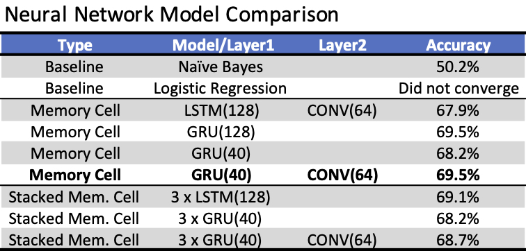
I chose to go forward with the GRU and convolutional network in bold in the table. This had less parameters than the GRU with 128 units, so this likely had a slightly lower variance. I trained this model for 10 epochs. After analyzing ROC curves to find the best thresholds the accuracy rose to slightly over 70% and gave the following confusion matrix.
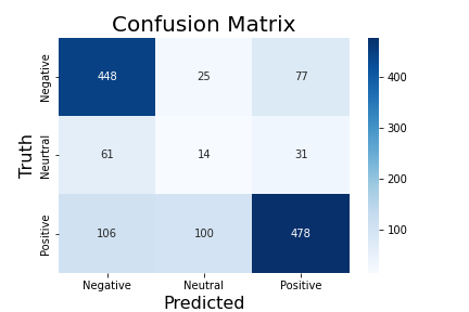
We can see that neutral tweets aren't the model's strength, but the classifier is quite good at predicting positive and negative tweets. This is likely due to the lack of neutral tweets. However, with a large enough sample size, the proportion of positive and negative tweets will likely approach the true result, and perturbations will be minimized. False positives and negatives are mostly due to sarcasm and tweets that require context.
Sentiment
Applying the model to the bay area tweets gives way to the following city sentiment map
Shapefile: Stanford Earthworks
The map shows an average of all the tweets sentiment values from each city. Comparing just positive and negative tweets versus the overall average including neutral tweets yields similar values. The large number of tweets from each city discouraged me from normalizing any values based on tweet count and city population, since this average is likely to be close to the true average of the city. Almost all cities had large sample sizes (2,000 to 5,000) except a couple small ones like Yountville and St. Helena.
It's important to note that almost every city was positive to an extent on average aside from a couple cities. The bay area seems to be a very positive place! I chose this color scheme, not so that pink and red represents negativity, but rather because those cities are more negative on average compared to the rest of the bay area.
The stark contrast between the peninsula and East Bay is astonishing. The next section will be dedicated toward a way to extract what people are happy and sad about.
Given the data was over one week during the extension of the COVID-19 shelter in place order, it would be interesting to see the sentiment for tweets relating to corona virus and the quarantine.
Shapefile: San Francisco data.gov
Corona virus tweets accounted for 5% of the data and didn't affect the overall sentiments significantly. I had to plot this at the county level, so the sample sizes were large enough to give a proper estimate of the sentiments. It's important to note though that Napa county only had 7 tweets relating to COVID-19.
Example corona virus tweets:
Negative tweet:
✔️ Largest wildfires in modern history
✔️ Senate acquits of Donald Trump
✔️ Death of Kobe Bryant
✔️ Global Pandemic
✔️ Financial Crisis
✔️ "Murder Hornets" discovered in US
Whatchu cookin' up next, 2020? 🙃
Neutral tweet:
My husband has been restaurant-phobic since this whole quarantine deal started up. I’ve finally convinced him to take a shot on some Chipotle takeout tonight. Nature is healing.
This tweet may seem positive, however, from the model's point of view, the first sentence is negative and the second sentence is positive. The GRU puts more emphasis on complete sentences and likely separates the two out. So classifying this as a neutral tweet makes sense from the model's point of view. It also shows the faults of the model.
Clustering
The theory behind clustering these tweets stems from the thought that people who are tweeting about positive things are likely tweeting about the same things. Similarly, for negative tweets. So, we can separate the groups positive and negative tweets, and cluster them into groups and see if they have any similarities.
If done correctly, this would give government and political officials a way of knowing what people are happy about and what people are unsatisified with in their city or governing area. Previously, the only way of consolidating such information would be through surveys which are expensive and could have a low turnout depending on the location.
Case Study: Berkeley, CA
The first clustering algorithm I used was K-Means, however, the data showed to be unfit for K-Means. Silhouette and elbow plots can be found in the repository under LSTM.ipynb.
I switched to Agglomerative clustering. This type of clustering doesn't work well with large datasets, so I decided to take only Berkeley's tweets cluster those. Below is the dendrogram for Agglomerative Clustering using Ward's Method with Berkeley's positive and negative tweets.
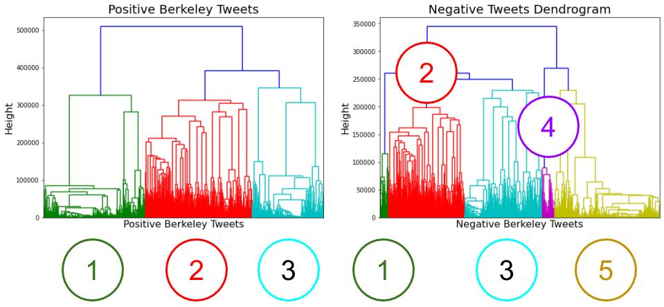
Considering the relative success of Agglomerative Clustering versus K-Means, it's likely that the clusters could be intermingled within each other (for instance one cluster is a ring and another cluster is a circle within that ring), problems that K-Means can't solve well.
Positive Clustering
-
- Tweets about other people's happiness
- wishing other people well
- sharing other's pleasant discoveries
-
- Thanking people! Short and sweet tweets, typically of the form
@twitterhandle Thanks! - Happiness derived from individual experiences
- Gratefulness
- Thanking people! Short and sweet tweets, typically of the form
-
- Happy about receiving something new (job, earrings, etc.)
- Non-mainstream news
- Advertising (
check out our ...) - UC Berkeley affiliated accounts
- Less individual, more about group happiness or directed toward groups of people
Negative Clustering
- Media accounts, very little personal accounts, mostly about the COVID-19 situation
- Large-ish tweets (100-200 characters) about various negatives such as Donald Trump, Joe Biden, personal experiences like kids falling off skateboards, and work
-
- Not much media, mostly personal accounts with 14% being about corona virus and quarantine
- Dissatisfaction with the federal government
- Dissatisfaction with Biden (recent sexual assault allegations). Far more tweets about this than the media, likely because Berkeley isn't a news/media giant.
- Angry tone
- Miscellaneous
- Very similar to cluster 2, except the size of the tweets is much smaller (around 50 characters). This is expected since the embeddings are padded to the same length, so shorter tweets would be in a smaller subspace.
Case Study Results
This clustering was able to distinguish the corona virus tweets. Here's a glance at the types of tweets you get from that cluster:
-
@[redacted] WE CAN'T POSSIBLY HAVE ANY FUN TILL AFTER THIS LOCKDOWN IS OVER WITH ALONG WITH A CURE FOR THE CORONA VIRUS ALONG WITH A VACCINE MADE THAT PEOPLE CAN TAKE MAKING IT WHERE WE CAN'T CATCH THE CORONA VIRUS!
@[redacted] People who want to reopen the state at the cost of service workers and others lives
There are legitimate concerns in the Democratic camp about what kind of steps other actors, including foreign actors and people with financial interests, will use to attack Joe Biden and other candidates. Assault accusations are probably not off the table on that front.
The clusters aren't perfect, but the ability for it to extract a large number of tweets relating to the pandemic is promising. At a quick glance at the cluster, you can find a noticeable amount of related tweets to COVID-19. Once the pandemic dies down, the cluster will likely be lost, however, it could also pick up on other community dissatisfaction in the future.
Results
We started with a dataset of tweets from the bay area and stripped it down to tweets that were likely to be from people who lived in certain cities within the bay.
The LSTM + convolution network performed the best out of the machine learning algorithms attempted and was able to classify positive and negative tweets pretty well. Applying that to the dataset gave us which cities are happier on average compared to others.
Lastly, we grouped the positive and negative tweets into clusters from tweets in Berkeley. We found interesting patterns in the clusters, but the most important was the cluster that extracted COVID-19 negative tweets, which points to a possibility of algorithmically detecting distress in cities.
Future Work
The training dataset doesn't include neutral tweets. It would be very beneficial if there was a way to include this, however, it seems almost unfeasible at the moment.
I only attempted recurrent networks, but attention networks may prove to have far better results.
K-Means clustering showed to be undesirable, however, agglomerative clustering had some promising results. It has the caveat of having very poor scalability. Also, the idea of clustering tweets is very difficult given the very large space the tweets lie in. Other clustering methods may show to be better, such as spectral clustering and DBSCAN (which also has the scalability disadvantage).
Of course this analysis becomes way more interesting with geo-tagged tweets. The problem is the scarcity of them, sepecially in this dataset which hovered around 500 tweets throughout the Bay Area, thus, it's hard to make any conclusive results or visualizations. Obtaining a large corpus of this could lead to some interesting results.
Ethical concerns
Twitter data poses ethical concerns. While their terms of service states that tweets may be used by 3rd parties, it's difficult to determine if people in the Bay Area were ok with their data being used for this analysis, and ok for me personally to look directly at their tweets. I however, didn't match twitter handle with tweets aside from looking at the general structure of the json output from the api, but I would figure many people still wouldn't be ok with this. There's also the fact that users may delete their tweets, but those tweets will still be represented in this post. Although aggregated with many others, it's hard to tell.
Twitter has a reverse geolocation feature which allows developers to grab tweets from a certain location even if users don't opt into geotagging their tweets. This allowed me to collect a lot of data, but it also allows 3rd parties to get a relative area where users tweeted, even if they don't want to give away this information. I'm sure Twitter handles this in their terms and services, however, I never knew of this feature before starting this project. Reverse geotagging should be made more transparent, because the fact 3rd parties can map out which cities users come from without opting into geotagging is concerning.
Also, interpretation of this analysis can lead to misleading results. For instance, this analysis relies solely on Twitter data, which may not be representative of the population you're analyzing. The bay area has a thriving Twitter following, so large issues affecting many people will likely be relayed through Twitter eventually. However, this may not be the case in cities with small Twitter followings (and even so in the bay area like in Napa County). I would suggest further testing to see for how many people are worried about some problem, 1 person will eventually tweet about it, and capturing this number will give an essence as to what kind of clusters and problems you can detect.
Addendum
I followed up and did the same sentiment classification a month later (May 25th to June 2nd 2020), when tensions were very high after the death of George Floyd.
Shapefile: Stanford Earthworks
Comparing this map to the previous map, the sharp difference between the peninsula and east bay remains. However, the bay area, especially those closest to metropolitan areas, are largely more negative on average. Regions around Oakland saw the sharpest drop, likely because of the racial demographics of the region and having a prominent Black population. Even regions around the pensinula like the San Mateo region saw a large drop similar to the East Bay as well. In fact, the drop around Oakland is statistically significant, as shown with the permutation test visualization below. The permutation test has a null hypothesis that the difference between the May and June sentiments are the same and an alternative that June sentiments are much smaller. The test results in a p-value of 0.
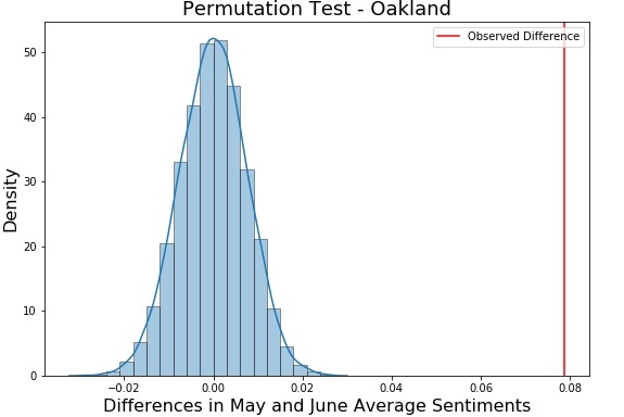
The numbers are also skewed positive in this instance since there are a number of tweets that confused the classifier. For instance, tweets such as
-
Oh my god [Image of violent protests]
Surely there is a hero out there somewhere?
There are a large number of tweets trying to spread love and show support for the movement in the bay area. This, along with the stock market trending up consistently since the corona virus outbreak and Census 2020 tweets make for a lot of things to be positive about. I'll leave the cluster analysis for the reader, however, it's relatively similar to what was stated above, except Covid tweets are replaced with the Black Lives Matter movement and the protests.